Wordpress Tips
10 Ways To Make WordPress Smartphone and Tablet Friendly
More people are getting used to the idea of using their smartphones or tablets to visit their favorite sites every year that goes by. If your website is not optimized for handheld devices, you are going to have a very difficult time making a good impression on your mobile visitors. Large businesses may afford to spend thousands of dollars to make their sites mobile-friendly. Most small businesses don’t. Here are 10 ways you can make your WordPress site smartphone and tablet friendly without having to go broke:
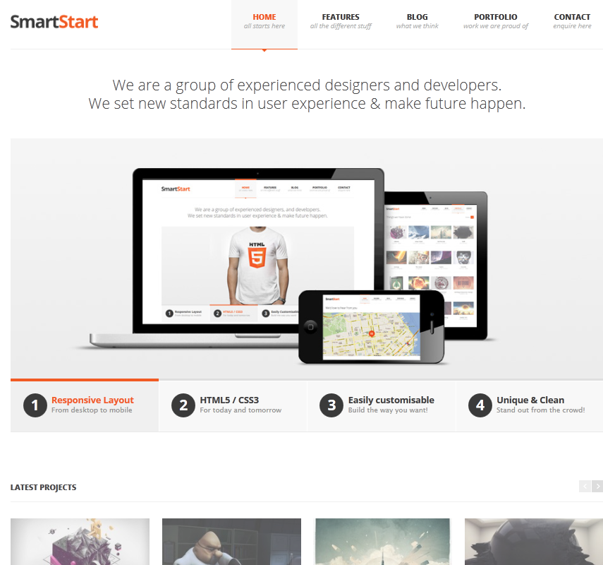
Adopt a responsive theme/plugin:
We have covered plenty of those here in the past. Many popular WordPress themes are already responsive. These themes will resize themselves on smaller screen, so your content will look professional without you having to do a whole lot of coding. There are also plugins you can use to make your content responsive.
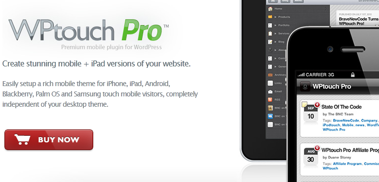
Serve a mobile-friendly version of your site on smartphones:
We use WPTouch for this job. You can find other similar solutions for free or a small fee. These plugins detect mobile devices and serve a smartphone-friendly version of your site on them.
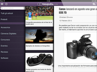
Develop your own mobile app:
If you have visited top blogs and news sites recently, you may have noticed that many of them offer iPhone and Android apps to their visitors. You could always make an app for your own website. It is not always cheap but tools such as Mobiloud can help.
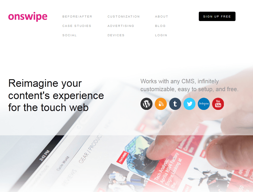
Adopt a touch-friendly platform:
Tablets and smartphones are controlled using touch-gestures. You need to make sure your site is optimized for that so your visitors can get the best experience possible visiting your site on their handheld devices. Onswipe and Google Currents are just a couple of tools you can use to offer a more dynamic experience to your visitors.
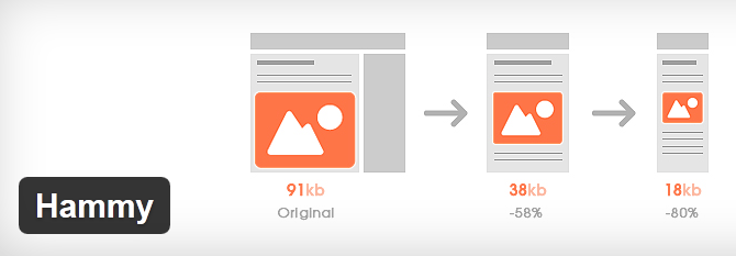
Optimize WordPress images:
If you have uploaded only huge images to your site without optimizing them, your site is going to look slow (even on regular computers). By using plugins such as Hammy or WP Smush It, you will be able to make your site look faster on all devices.
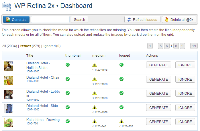
Make your website Retina ready:
Smartphones, tablets, and laptops with Retina displays are already available for sale. Thanks to plugins such as WP Retina, you can make your site look more beautiful on Retina displays.
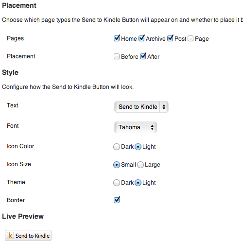
Add Send to Kindle to WordPress:
Kindle devices have reached millions of homes already. Not all of your visitors will have one of those. But adding the Send to Kindle button to your site will make consuming your content for those who do even more convenient.
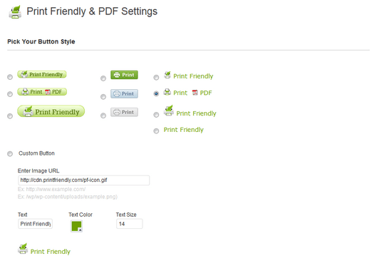
Make your site PDF-ready:
This could prove useful for those of you who write long posts. Your visitors are more likely to want to print those articles in PDF format to read on their tablets or e-readers at a later time. Print Friendly and PDF Button is just the plugin for the job.

Integrate Read-it-Later services with WordPress:
Instapaper, Pocket, and Readability are useful services to take advantage of to save content and view them on computers or handheld devices at a later date. Just use the appropriate plugins to add their buttons to your site quickly.

Make your images and content responsive:
Even if your theme is not fully responsive, you certainly do not want your images, videos, and other content to look out of place on small tablets and smartphones. Plugins such as WP Fluid Images help you make sure that does not happen.
As you can see, you don’t have to spend a fortune to make your site smartphone and tablet friendly. Smartphones and tablets are here to stay and will only get more popular. The sooner you optimize your site for them, the better off your business will be.


![10+ Ways To Speed Up WordPress for Better Google Rankings [Infographic] 10+ Ways To Make WordPress Faster for Google](https://www.wpsolver.com/wp-content/uploads/2022/09/20/10-Ways-To-Make-WordPress-Faster-for-Google-50x50.png)
