
There are plenty of fancy themes on the market but not all of them work well on mobile and desktop devices. Even the plugins you install can break on mobile devices if they are not designed properly. The Divi Responsive Helper is a handy plugin that helps make your site look professional on all devices.


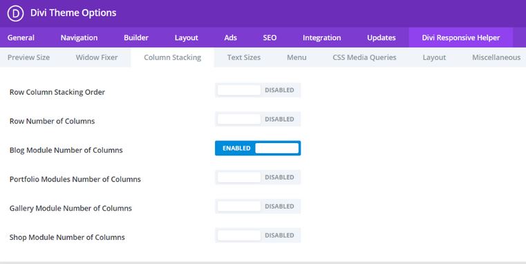
This plugin lets you choose the number of columns that stack side by side on all devices. You can change the number of blog, gallery image, portfolio, and WooCommerce product columns. As you make changes, you can preview how your pages would look like on any device. It also comes with custom CSS input boxes to cover more devices.


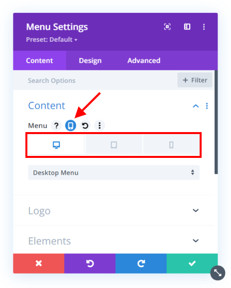
This plugin lets you choose when to show the back to the top button. Want to use a different logo on mobile devices? No problem.
